5 Ways to Reduce Returns with Product Photos

5 Tips to Reduce Returns with Catalog Photography
The old idiom says a picture is worth a thousand words but did you know a picture can also be worth thousands of dollars in returns and, inherently, lost customers. A little known fact in the ecommerce industry is that you can actually reduce returns with product photos!
Shopping online, especially for fashion and apparel, can be a frustrating experience when product photos are lacking details or downright deceptive. Unlike shopping at brick and mortar store, the customer doesn’t have the opportunity to feel the fabric, see its true colors, or try it on for fit. Catalog photography is needed to supplement these experiences to ensure the customer is buying something they’re going to keep.Here are five ways to improve your product photos and curb your return rate:
1. Be Honest
First, you have to be honest with yourself. Is the product great? If it’s a dress: are the cuts form fitting? Is the fabric quality? Is the stitching seamless? Whatever you learn while inspecting the product in your office or studio the customer is going to find out when it reaches their doorstep.
Get ahead of any problems now! A catalog photo’s job is not to hide the products flaws but to present the consumer with realistic portrayal of what they are purchasing. If the product is of a poor quality or poorly designed in some way, it may be worth pushing back against the purchasing team, designer, or manufacturer to ensure it is what they planned on taking to market.
Why? Because when you sell someone gold and send them pyrite, they’re unlikely to trust you ever again.
If you were to take a poorly made dress, photoshop the heck out of it, and put it on your website, chances are you’re going to annoy your customer and burn some bridges when they receive the item.
Dishonest product shots are a surefire way to increase your return rate and cripple your CLV (Customer Lifetime Value). If you want to reduce returns with product photos, you have to be honest with your customers and continue building trust for future purchases.
2. How’s it hanging?
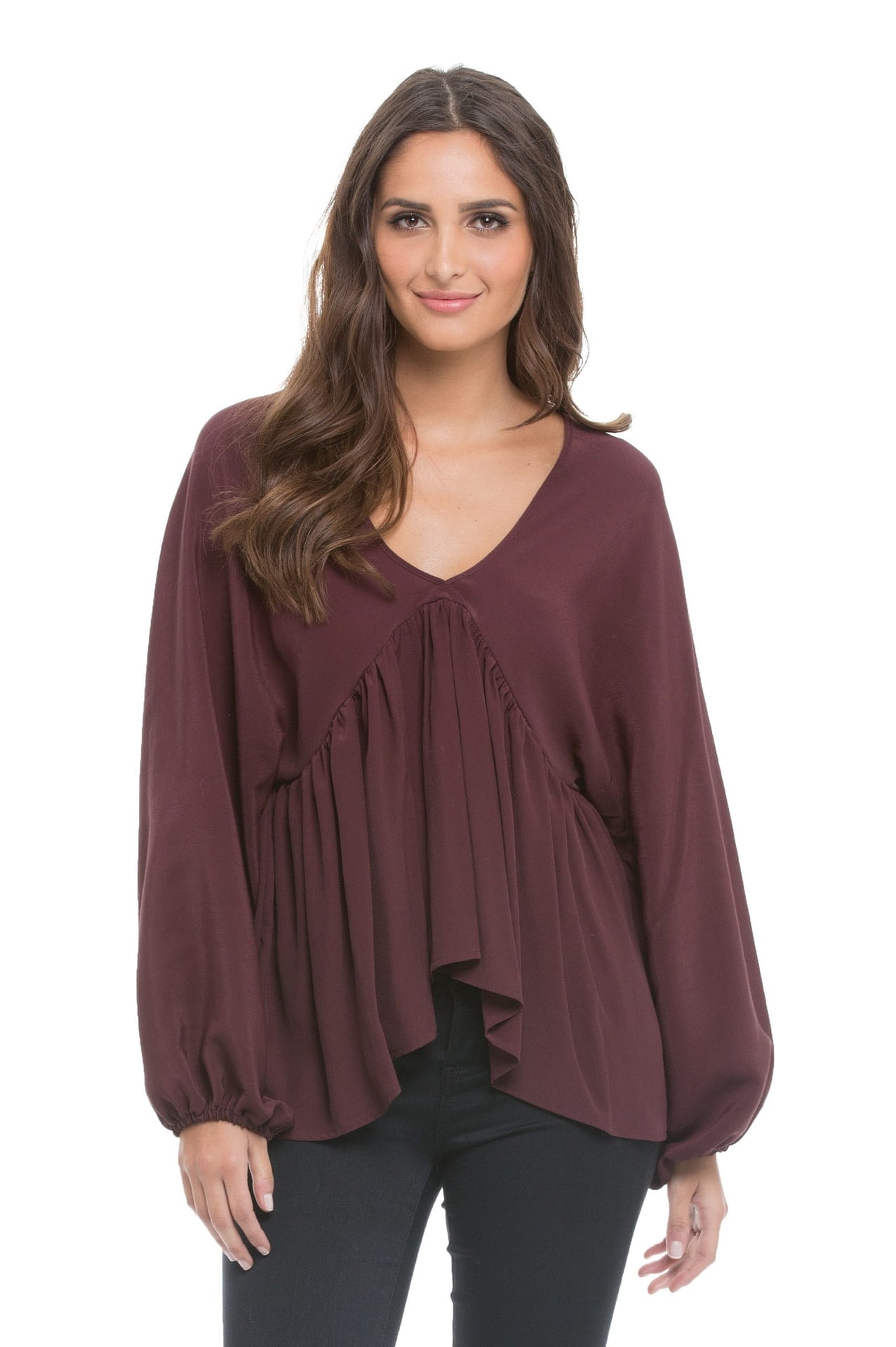
Do your catalog shots capture how your product hangs from a real person? Binder clips and double-sided tape are cheap. Returns are expensive. This may be a rehashing of point #1 but point #1 is a really great lesson: your product needs to be portrayed in a realistic fashion to keep the customer from feeling deceived by your brand.
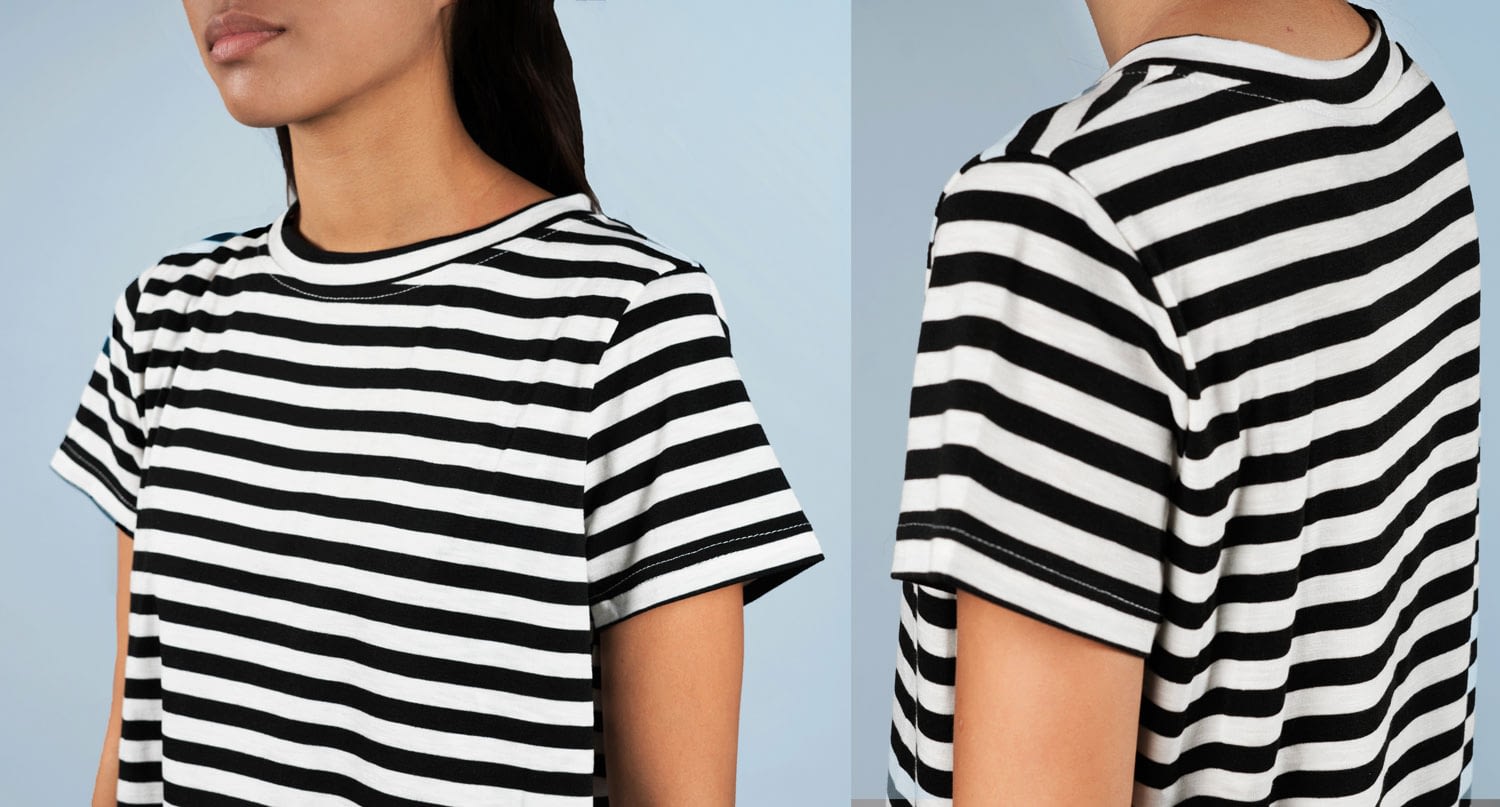
 If you need ten binder clips to make that t-shirt look good that might be a red flag!
There’s plenty of psychology behind the way your brand’s deal with displaying their products on mannequins or models, but however you choose to present your product, it is vital that it be in line with how it will hang from the end user’s shoulders.
3. Work the angles
In crime movies we often see a detective get frustrated and slam a desk because the suspect escapes the view of the security camera. That is how your customer feel’s every time they find an item they might like and there aren’t enough photos of it. There are too many blind spots and the case is never going to get solved: unless they buy it. And that is big problem for you.
What’s wrong with getting another sale? The problem is that purchase might be headed back to you very soon. To get a realistic understanding of what you’re selling, customers will sometimes “preview” it. Don’t get this practice confused with buying two sizes and returning the one that doesn’t fit. “Previewing” is solely for the purpose of inspection and can be abused depending on your return policy.
Avoid the problem in the first place with shots from all angles. The customer wants
to feel like they’re in your store holding the merchandise before committing to buying it AND keeping it. The back. The sides. 3/4 view. The hidden pocket. The logo on the sleeve. Every single shot builds to the customer buying the full picture rather a “preview”.
4. I’m ready for my close up
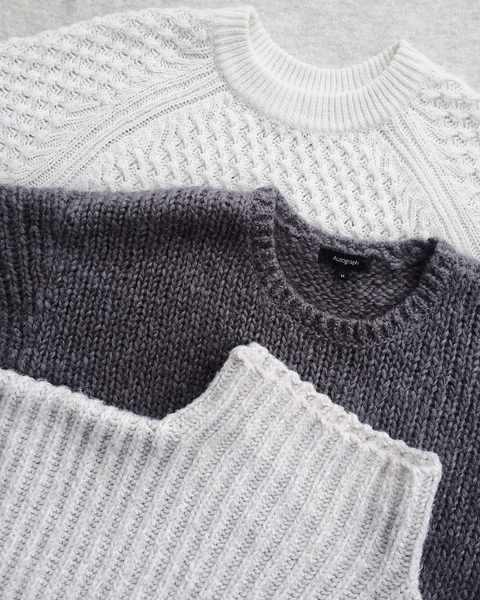
This one is simple: every product has minute details that are worth showing off. Does the fabric have a notable texture? Does that dress have pockets? Does that handbag have a patterned lining?
It’s up to you to call out these simple extras that enhances the shoppers sense of understanding what they’re purchasing. There should be a sense of excitement, not surprise, when they hold the item in their hands for their first time. Not an “Oh, I didn’t notice that ______ in the picture.” The first step to reduce returns with product photos is to provide a clear and full picture of the product.
5. Action Shots
Your shots look brilliant in the studio with its perfect lighting and team of stylists. But will it looks as great out in the wild?
Everyday there are new social posts and clickbait articles showing off the “expectation vs reality” of items ordered online. Not every product is going to fit the customer the way it fits a professional model, still you’re going to need a way to manage expectations without taking away from the glamour of your catalog photos.
 If you think that the expectation based on your photos could be troublesome, then secondary action shots may be helpful in alleviating the disconnect from reality. Many brands crowdsource action shots through customer reviews or collect photos through paid influencers but that takes time and leave you with little control over the final result.
A helpful alternative could be sending some staffers outside with an iPhone and some items to shoot in a desirable yet realistic fashion.
It may be scary, but taking away the lighting, heavy makeup, and professional model, and bring your gear into the world (important to choose locations that are on-brand) so users can see what it is they’re really in for.
In Closing
These are recommendations based off of our experience with a variety of eCommerce brands. Every brand is different and has a unique way of doing things that resonates with their customers. Don’t feel the need to check all boxes we discussed! A $25 graphic t-shirt should be handled differently than a $2,000 dress. Take some time, look through your catalog, and ask yourself if the shots are honest. As long as you’re doing #1 you’re off to a good start. Trust and transparency are heavily influence by the way you’re displaying your product.

